Sunset Photos of Bannerman’s Castle in the Hudson River

Bannerman's Castle on Pollepel Island in the Hudson River at SunsetMost people living in the Hudson Valley are familiar with the majestic treasure of Bannerman’s Castle. This romanticized castle sits on Pollepel Island in the Hudson River a bit North of Cold Spring, New York. It was built by Francis Bannerman VI between 1901 and 1918 when he died. Following his death the structure withstood damage when 200 tons of ordinance stored nearby exploded in 1920. A subsequent fire destroyed the buildings, non-structural walls, roof and floors. In December of 2009 almost half of the castle’s front and east facing walls crumbled following a major wind storm.

I decided to take the time to stroll over to the Eastern shore of the Hudson on an unseasonably warm March evening in 2012 in an effort to capture the scene with my camera. Did I ever pick the right night to do it too.

The sun was setting directly over Pollepel Island’s hill framing the castle as a perfect black silhouette. The sun’s reflection also glistened in the Hudson River creating a seriously powerful image. Although the timing and location of the sun was perfect, the extremely clear sky left a little to be desired in terms of color and background. So I opted to use a red graduated filter in the above example to create a very powerful effect. I toyed around with other filters as well to create some very unique effects.

The photo could be used in advertising and marketing for the following concepts industries:

  • Summer
  • Evening
  • Strength
  • Romance
  • History
  • Guidance
  • Faith
  • Financial
  • Tourism

If you have never viewed Bannerman’s Castle, you shouldn’t wait to long the structure is deteriorating at a rapid rate. Fortunately, I managed to preserve Bannerman’s majesty for future generations with photography. You can view the full series in the stock photography portion of this website by clicking the following link https://www.ortnergraphics.com/stock-photography

Clearwater Music Festival Sunset Photographs

Photograph of Clearwater Music Festival at SunsetBeing a great musician has its benefits. One recent perk was the opportunity to attend the Clearwater Music Festival on June 15, 2013. My comp passes came complete with backstage camping right on the Hudson River. Although the music was certainly great, the visual artist in me always keeps an eye out for opportunities to capture visual beauty. This festival certainly had a bounty of subject matter, most of all its sunset.

Clearwater was blessed with some of the most gorgeous late spring weather the Hudson Valley has seen in years. The crystal clear day with unobstructed 15 mile views up and down the Hudson River resulted in an amazing sunset. This created a stunning backdrop for the band as they performed an eclectic blend of world fusion on Clearwater’s Hudson Stage.

Since I was mostly attending the concert as a spectator I brought a bare bones camera rig with me. I only came prepared with a Nikon D90 and a Nikor 18-105 3.5 lens as well as a 28-300 mm Sigma Lens. Fortunately the evening sky was perfectly lit and didn’t need much assistance from me in creating a dynamic concert image. I particularly like the way the audience’s hair glistens in the rays of summer sunlight. It creates a great example of graphic closure for the silouhetted foreground.

The series of photos taken could be suitable for advertising campaigns in the following concepts and industries:

  • Summer
  • Concert Promotions (Tickets, Posters, Flyers)
  • Entertainment Industry
  • Album Covers
  • Alcoholic Beverages
  • Youthful Lifestyle

Click here to view, or purchase more examples from this series of photographs.

Review of Rage Software’s Sitemap Automator for Mac

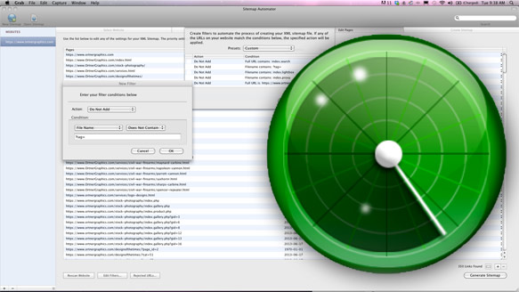
Screengrab of Sitemap Automator with Sitemap Automator Logo superimposed over it

The simple intuitive interface of Rage Software's Sitemap Automator

Apple MacIntosh are really great computers. The PC guys will tell you over and over again how Windows systems are better. I used to run Adobe Photoshop and Illustrator and Quark on a Windows machine, but I finally broke down and bought an iMac about 10 years ago and never looked back. There are some serious drawbacks, though, regarding Macs and the biggest one has always been the lack of software and especially free software. I hadn’t really run into this issue in a while, but I finally did this week when I decided it was time to add a sitemap to OrtnerGraphics.com.  After spending several hours searching the web for a free solution I finally broke down and purchased Rage Software’s Sitemap Automator.

I was initially lead to Sitemap Automator by my webhost. It was the only Mac supported app in a long list of free Windows suggestions. Therefore, Sitemap Automator was obviously the first one that I checked out. However, the $30 price tag really scared me away. I figured I would find a free version just as good so I kept looking. However, I quickly noticed that mostly what I was finding were people lamenting the fact that there were no good free sitemap generators out there. Before ultimately purchasing Sitemap Automator I also tested OmniGraffle Sitemap Generator, iGoomap, and googlesitemap.

It became immediately obvious to me that Sitemap Automator was far superior to these other generators due to its robust filtering capacities. Sitemap Automator gives you the ability to scan a website and Ad, Not Ad, Change Priority, Change Frequency or Set the Last Modified date of specific pages for your sitemap. To do so it uses Actions such as Full URL, File Name or Parent Folder. It also further refines your filter with conditionals such as Is, Is Not, Contains, Does Not Contain, Starts With, Ends With.

For me the “Do Not Ad File Name Contains” filter was just a huge time saver and important when creating a search engine friendly sitemap. None of the other sitemap generators I tested had anything like it that I noticed. It allows you to take all of the automated PHP files (which Google hates) and simplify them quickly and easily to just the pages with important content. This way you can run a quick filter and exclude all of the linked files on your WordPress blog that contain “?tag=” and remove them from your sitemap in seconds. Not having the ability to run a filter like this seems to really defeat the SEO purpose of a sitemap generator in the first place. Using the the Sitemap Automator I was able to scan a website which turned out to have over three thousand automated pages and simplify the sitemap to only 350 pages that contained relevant content. It only took me about five or six minutes to sort through the data that the site map crawled and determine which pages needed to be eliminated.

Once you are done filtering your website’s pages, you can use Sitemap Automater’s handy FTP upload to add the final sitemap.xml file to your server’s root folder and even submit the updated map to Google.

There were a couple of  drawbacks to Sitemap Automator that I noticed. The first was that it seemed to take Sitemap Automator longer to crawl the website and return results than the other generators that I tested. Secondly it crashed both times I used it while running filters, so the software clearly has some bugs and isn’t entirely stable. However, it seemed to have saved the results from its crawl so I just needed to run the filters again. All and all, though, these hickups were far outweighed by Sitemap Automator’s robust filtering system. My only serious lament is that I wasted three hours of time trying to save $30. My other problem is that I still need to turn on a Windows Machine once in a while to test websites.

Letter of Recommendation

Letter of Recommendation from Matt Rand

This is a letter of recommendation from Matt Rand describing Eric Ortner's qualifications as an Art Director


I received the following recommendation from my former employer. It’s pretty glowing so I decided to share it with the World Wide Web.


“April 18, 2013

To Whom It May Concern,

I have worked closely with Eric Ortner for the 7 years he was employed as Art Director at my company, Rand Realty. Mr. Ortner excelled in this role and completed hundreds of design projects for our company, on-time and on budget.

Eric is well versed in both print and online design and is exceptional at creating well-conceived design themes around loosely defined specifications. The quality of Eric’s work, organization and attention to detail are excellent. He has been a great steward of our brand and maintained consistency to our brand standards across many platforms.

I volunteered to write this recommendation for Eric because I am very grateful for his contributions to our company and am very confident that he has the intelligence, work ethic and design skills to add value wherever he works. Please feel free to contact me if you have any questions about Eric.

Sincerely,

Matt Rand
Managing Partner

What Is a High Resolution Photo?

Resolution is basically the amount of detail that a digital image holds. Resolution is a somewhat difficult concept to understand because it varies depending on the final output size. Therefore, a photo considered  high resolution in some situations would be considered low resolution in others.

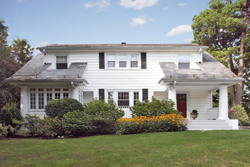
For example a photo intended to be printed at 4×6 inches with pixel dimensions of 1200 pixels x1800 pixels would be considered high resolution (hi-res). However, those same pixel dimensions would be construed as low resolution (low-res) if the final output or print would need to be 8.5 inches by 11 inches.


Example of Low-Res Photo

Low-Res Photo

Example of a Hi-Res Photo

Hi-Res Photo


As a general rule for most purposes whenever a high resolution (hi-res) photo is requested it should be at least 2700 pixels by 1800 pixels or in other words 9 inches by 6 inches at 300 DPI (Dots Per Inch). If your photo is larger than this, that is great! A file can never be too high resolution in terms of print production. Always keep the largest versions of your photo in a safe place in case you need them again in the future.


How Do I Determine a Photo’s Resolution?

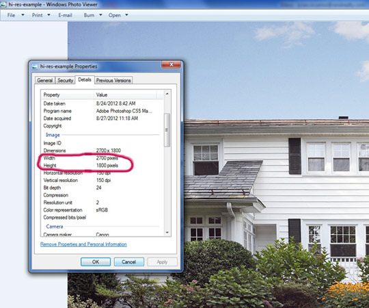
Determining whether the photo you have is high resolution or not can be done in 5 easy steps.

Step 1. Open the photo of interest in Windows Photo Viewer.
Step 2. Go to the File Menu and Select Properties
Step 3. Click the Details Tab
Step 4. Under Image look at “Horizontal Resolution” (if it is smaller than 2700 pixels it is Low-Res)
Step 5. Under Image look at “Vertical Resolution” (if it is smaller than 1800 pixels it is Low-Res)

Preview of a Hi-Res photo in Windows Photo Viewer

The circled information in the properties menu of Windows Photo Viewer is what you need to determine an images resolution


Why Do I Need a High Resolution Photo, Can’t I Just Use the Photo I Loaded into Facebook or Somewhere Else on the Internet?

High resolution photos are required for sharp reproduction in print publications. Otherwise the printing quality is very poor. It is our goal to present our client’s inventory in the best light possible. Reproducing a low resolution photo looks unprofessional and can actually make a product or service look ugly or unusable.


How Do I Get a High Resolution Photo in the First Place?

A good professional photographer will usually give you the hi-res photos from the shoot once it is completed and paid for. If for some reason you can’t afford a professional photographer, when taking photos of your product or services you should be using the highest resolution setting on your camera. It is also a good idea to keep the JPEG compression at the highest quality settings. Cameras vary from manufacturer to manufacturer, so you will need to refer to your specific camera’s manual to learn how to adjust this.


So Why Would I Ever Want a Low Resolution File?

Low-Res photos typically have a smaller file size than a hi-res photo. Therefore they are favorable anytime you are posting a photo on the internet because a smaller file size results in a faster download. In addition, on-screen viewing does not require the same great amount of resolution that a print publication does even in high definition. This is due to the greater number of lines per inch required to produce something in print verse on screen.


Real Estate Billboard Design

Ridgetop Estates Real Estate Billboard

Ridgetop Estates Real Estate Billboard located on Route 17 near Chester, NY

BIGGER IS BETTER! That generally rings true in marketing, of all the large scale pieces of collateral available to marketers perhaps the biggest is a billboard. Therefore, it’s always great to have the opportunity to work on such a project.

The Ridgetop Estates billboard sited along Route 17 in Chester, New York was created in the summer of 2010. The production of this billboard was comprised of numerous components. First there needed to be a professional photo taken of the model home. Therefore, a favorite photographer was sent to the site. Prior to the actual shoot the location was scouted relentlessly to determine what the best time of day was to capture the perfect light. Unsurprisingly it turned out to be about an hour before sunset. The photographer utilized a medium format camera to ensure there would be proper resolution for the final grand format print. The chosen chrome was sent out to be drum scanned for a digital file.Once the digital file was returned, it was retouched a bit. The grass, driveway and sky were altered to better fit the final composition layout.

The layout in this case required some serious political maneuvering on the part of the art director. You see, the developer wanted to list many of the home’s features along with their logo and phone number in addition to the real estate brokerage’s. It took quite a bit of convincing when working with all of the parties involved that listing the home’s features would be too much information for a billboard. The typical convention of billboard design mandates that the audience only has approximately 5-10 seconds to read all of the information before they have driven past.

After much gnashing of teeth, the internal and external clients were convinced to limit the design to one phone number and eliminate the home’s features and only list the price and location. In a perfect world the phone number would have been large across the grass below the home, but having convinced everyone to limit the contact information to one line some compromise was required. Compromise was also required to allow both the broker and developer’s logos on the billboard.

Upon approval of the final design the files were sent off to the billboard owner’s preferred vendor for grand format print production and installation.

Direct Mail Anniversary Card Using Variable Data

Anniversary Card Direct Mail Variable Data

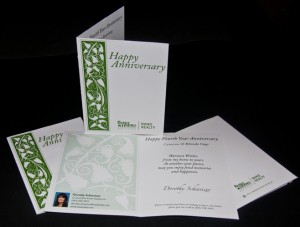
Anniversary Card commemorating the purchase of home, which utilizes variable data for both the client and real estate agent.

Here’s an interesting concept for the use of variable data with direct mail as a way to maintain a continued relationship with past customers. The anniversary card design is a great tool for keeping your business in the minds of your old clients. In this example, which was designed for Better Homes and Gardens Rand Realty, the anniversary of a home purchase is commemorated. However, this same concept could be useful as marketing collateral to remind past customers about any big ticket purchase such as a car or appliance.

Because this example commemorates a home purchase, an elegant anniversary card graphic was created. It utilizes Better Homes and Gardens Rand Realty’s standard green branding spot color and what could be considered a typical scrolling, flower motif on the front cover. While the inside of the card utilizes variable data printed in four color on a digital press.

On the inside of the card, variable data consisting of the Real Estate Agent’s photo and contact information is printed on the left side.  The inside right panel of the anniversary card uses variable data of the client’s name giving the direct mail piece a vPery personalized appearance.

To minimize production costs, only the inside of the card is produced using a variable, digital press. The outside of the card is printed on a traditional offset press and left un-scored or folded. The print vendor then stores these shells and prints the variable agent and client data as the anniversary date arrives. The print vendor and mailing house also produces a personally addressed, envelope and then stuffs and fulfills the mailing.

The beauty of this project is that it is a drip campaign that essentially maintains itself using a minimal amount of information. All that is required is a database of the sales staff that maintains their contact information, a corresponding photo, and a list of the names and addresses of their past clients. This data is then fed to the print vendor and mailing house with next to no intervention from you. Just imagine the possibilities of this project for your retail business.

Real Estate Direct Mail Postcards Promoting Listing Syndication

Pile of Direct Mail Postcards

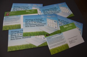
Thinking of Selling? We'll showcase your home on all of the top national and local real estate websites. This is a variable direct mail post card for use in the real estate industry.

Creating an engaging direct mail post card design can be a challenging task. Especially in the field of real estate where postcard designs are most often simply a photo of a MLS listing along with a brief description of the property on the back. The above design breaks the mold of standard real estate postcard designs.

The Thinking of Selling concept pictured above promotes Better Homes and Gardens Rand Realty’s listing syndication through social media and real estate websites such as Facebook, Trulia, Realtor.com and Zillow, to name just a few. A stock photo of a laptop computer was used to drive home the fact that this message is about an information technology service that the company offers. The real estate websites logos were then assembled in Adobe Illustrator and warped to match the laptop photo’s perspective in Adobe Photoshop. The Laptop was also silhouetted in Photoshop so that it could then be imported into Adobe InDesign and placed over Rand Realty’s standard grass/sky background branding image. The text was also written and typeset in InDesign and the logo was placed in the top right corner in accordance with Better Homes and Gardens Real Estate’s branding standards.

To ensure a cohesion between the front and back of the postcards the grass/sky image was used again as a background for the text. The body copy on the back further drives home the point to the card’s audience the significance of getting the potential lead’s home on as many websites as possible.

Better Homes and Gardens Rand Realty utilizes a direct mail vendor with the ability to create postcards with variable text and photos. This gives their agents the opportunity to include all of their contact information along with headshot on the card. They also could customize the message on the back of the card to suit their needs.  This all ads up to an effective direct mail campaign. The postcard was so successful and popular with the real estate agents that the design was modified and resized to run in several of the Hudson Valley region’s publications as a branding ad.