Distinctive Collection Luxury Real Estate Branding Ad

Distinctive Collection Luxury Branding Ad

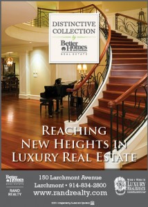
Distinctive Collection Luxury Real Estate Branding ad for Better Homes and Gardens Rand Realty.

Working for a real estate company in the Northern Suburbs of New York City certainly gives you the opportunity to market a great deal of luxury homes. A big part of that, though, is convincing the area residents that you understand their needs. Here lies the importance of a luxury branding campaign. Better Homes and Gardens Real Estate currently uses the Distinctive Collection brand to accomplish this.

The above ad was designed with the sole purpose of increasing brand awareness of the new Distinctive Collection Brand. The luxury market and need for an unimpeded prominent logo resulted in a rather simplistic ad design.

The copy for this ad concept was written by the Art Director. Since Distinctive Collection is a relatively new brand I felt that it was only logical and important to include the word “New” in the text. But, how is that accomplished? After some image research for luxury interiors I decided that I really liked staircases for a luxury real estate brand. With that direction and after a bit more brainstorming I came up with “Reaching New Heights in Luxury Real Estate.” A slogan that I felt was simple, to the point and not too kitsch.

It was decided that the first staircase I used for this project just wasn’t luxurious enough. So it was back to iStock Photo for another image search when I found the photo that was ultimately used. It’s perfect for luxury, wrought iron railings with a curved staircase concealing and baby grand piano. I can’t think of a room too much more luxurious than that!

Mountain Lake Estates Real Estate New Development Sign

Mountain Lake Estates New Development Signage

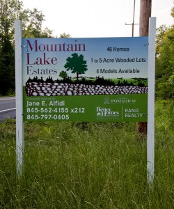
Mountain Lake Estates signage for a real estate new development on County Rd. 21 in Wallkill, New York

It is always so exciting when you unexpectedly run into one of your old designs on the street. While driving some back roads through Orange County, New York  to go to the Shawangunks this morning for a hike, I stumbled upon a project I worked on in the fall of 2010. It was some signage for the real estate new development, Mountain Lake Estates, near Newburgh, NY.

I remember being disappointed with the outcome of the project because there were many changes made that I didn’t really think were improvements to my initial design comps. However, I was surprised to see that the actual sign came out a lot better than I expected it to. It actually really stood out on the road.

The stone wall graphic on this signage was  drawn by hand, scanned in on a flatbed scanner, and then Autotraced in Adobe Illustrator. The Mountain Lake Estate’s sign layout as a whole was also created in Adobe Illustrator.  The sign was created as a  6 foot by 4 foot grand format print mounted to allumalite and installed on 4×4 posts. I kind of wish the installer had cut the posts down a little bit. I guess I’ll have to call them about that on Monday.

Wall Street Journal Luxury Real Estate Insert

Distinctive Collection Wall Street Journal Catalog Insert

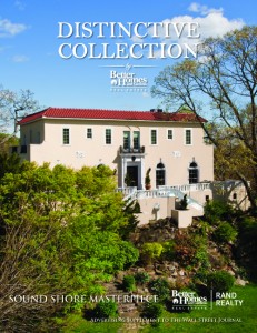
Cover for catalog insert in the Wall Street Journal promoting the new "Distinctive Collection" luxury real estate brand created in Adobe InDesign

Realogy’s Better Homes and Gardens franchise has dropped their Premier Selections luxury brand and replaced it with the Distinctive Collection brand. It was perfect timing for Better Homes and Gardens Rand Realty as they entered their spring market campaign. The Rands decided to promote their extensive inventory of luxury homes with a catalog insert in the Wall Street Journal.

Being such a high profile marketing campaign it was incredibly important that the cover use a highly compelling photograph. Conveniently Rand Realty had just struck up a new relationship with Edberg Marketing. Edberg specializes in real estate photography and has the capability of taking elevated photographs.

Simply put, elevated photography raises a camera on an extending mast and tethers the camera to the operating photographer on the ground. The photographer has some limited ability to pivot the camera in order to get the correct angle. However, due to the height the mast often sways in the wind causing some motion blur on many of the exposures.

The Distinctive Collection cover proved to be a very complicated shoot for a variety of reasons. The first reason being that, as always in the world of marketing, we were on tight time frame. The time factor was further compounded by the terribly wet spring that prevailed in 2011. Edberg was forced to try and make the shot in iffy weather at least three times before they finally got some decent light. A second complication was that Edberg was unable to take a vertical photo due to the way that the camera mounts on the elevated mast. Typically in real estate photography this wouldn’t be an issue because horizontal compositions tend to be the preferred format. Unfortunately, Edberg was only able to mount an EOS Rebel on the mast, so a horizontal photo did not hold the required resolution for a high quality cover photo. After a great deal of back and fourth Eric Ortner finally was able to figure out a solution to the problem. With a great deal of reluctance on their part Eric managed to get Edberg to release him the Raw CR2 files. He then opened them in Photoshop at the largest Raw settings effectively faking in resolution. This gave resulted in a large enough pixel dimension to create a hi-res cover photo.

The work didn’t stop there however. Due to the home’s foliage there was a great deal of retouching required. The tree in the front of the house cast unsightly shadows all over the front of the house. The solution, remove the tree and shadows in Photoshop. This required about three hours of retouching. As we all know though, a cover photo with blemishes might as well not be printed. This is especially true when pitching to a luxury market, where everything must be perfect. The following examples are the before and after of the retouched photos.

Original Luxury Real Estate Cover Photo

Original photo with branches and shadows obscuring the front of the home.

retouched cover image

Photoshop Retouched cover photo which removes the tree's branch and shadows.

The Distinctive Collection cover proved to be a rather hi-stress project, but in the end it resulted in a great quality high impact presentation piece.

Hudson Heartbeat Lifestyle Blog Branding Ad

Real Estate Lifestyle Branding ad for Hudson Heartbeat

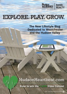
The Explore. Play. Grow. HudsonHeartbeat.com Lifestyle Branding Ad for Better Homes and Gardens Rand Realty

It was decided that a major portion of the  marketing campaign for  HudsonHeartbeat.com branding would need to be focused on the Hudson Valley lifestyle. This ad was designed with the Luxury market in Westchester County in mind. After some exhaustive image research and a few other design comps we decided that we should down play screen grabs of the actual site. Instead Rand Realty’s owners wanted to present it as a lifestyle ad. This style actually ties in more with the typical branding ads produced by Realogy‘s Better Homes and Gardens Real Estate franchise branding.

Initially the design used an image of a laptop. However, the new iPad was so much fun that we though it would be more hip to use an iPad instead of a laptop and better reach our luxury audience. The main background photo of the Adirondack chairs, dock, and water is from iStockPhoto. Eric Ortner took a studio photo of an iPad matching it to the perspective of the iStockPhoto shot. He then superimposed a screen grab of the HudsonHeartbeat.com site into the iPad image in Adobe Photoshop. Mr. Ortner then used Photoshop to place the iPad image into the Adirondack Chair Image. Upon purchase of the Hi-Res Adirondack chair it became clear that additional retouching of the iStock Photo image was required. In addition to being distressed, the hi-res photos revealed that the chairs had a great deal of dirt and mildew on them. So Eric Ortner needed to “repaint” the chairs in Photoshop. Some careful selection, masking, feathering and layering eliminated the filth. The page layout’s, photo, logos and text were then all put together in Adobe InDesign.

This branding ad is being used extensively in local publications throughout New York’s Westchester the Hudson Valley. It has also been turned into a postcard and flyer.

Hudson Heartbeat Video Contest Flyer

Hudson Heartbeat Video Contest Flyer

Flyer Promoting the Hudson Heartbeat Video Contest

On April 1, 2011  Better Homes and Gardens Rand Realty released its new lifestyle blog dedicated to Westchester and the Hudson Valley. The goal of the site was to further enhance Search Engine Optimization as well as awareness of  RandRealty.com by generating traffic from an audience that wasn’t necessarily looking to purchase real estate. One chief component of the site is user generated community profile videos in the spirit of social media. What better way to garner this sort of video content than through a video contest. The flyer above was designed to entice a youthful and creative audience to enter their work in the video contest. The flyer’s design also closely follows the general design system used for on-air advertising promoting Hudson Heartbeat. This was done to reinforce the sites brand identity. The flyer has been posted in colleges and areas where young creative types may be found. This design was created entirely in Adobe Illustrator and will also be used on postcards and possibly print ads.

OrtnerGraphics.com launches Design of the Times Web Log in OrtnerGraphics.com 3.0

After working professionally in the field of visual communications for the past fourteen years I am pleased to post the first blog entry in the brand new Design of the Times Blog. As I’ve been working on the design of this blog, and the whole of the third redesign and launch of OrtnerGraphics.com, I’ve established a tentative strategy for this web log. The ultimate goal is quite simple; to keep a running weekly tally of the best work that I produce.

Looking back on the past fourteen years of professional experience, I’ve found that I barely remember the majority of projects that I’ve worked on. My hope is that this blog platform will aid me in inspiration for future projects, and help to keep me from slipping into similar pitfalls of past projects.

I believe that as the field of graphic design continues to evolve it will be interesting to watch design trends and techniques emerge through this weekly catalog of work. My goal is to only include my own creations or possibly the work of my subordinates. However, I may also include designs that I deem to be especially revolutionary regardless of their creator.

The type of design work that I expect to publish in this site will be primarily graphic in nature and I anticipate that it will include:

  • Logos
  • Layouts
  • Illustrations
  • Photographs
  • Websites
  • Flash Banners
  • Motion Graphics
  • Video
  • Discussion on Branding and Brand Strategy

My plan is to include some textual explanation along with the specific examples in order to examine the overall marketing strategy of the piece. In some cases where there is an interesting design process I may also include the proofs that lead up to the final approved design.

In short, I’m really looking forward to discovering where this blog forum on the world wide web takes me.  Thanks for your interest in my work!

So without further ado, let me introduce the First Design of the Times.