Feist Performs at Tarrytown Music Hall with Special Guest Kevin Drew

[slideshow_deploy id=’314′]

Eric Ortner had the opportunity to work as the official photographer for the Feist concert at Tarrytown Music Hall on Thursday, April 10, 2014.

The show opened up with Kevin Drew who performed on guitar and piano. Kevin founded the band Broken Social Scene, but at this performance he worked solo. He sang several songs on guitar before moving over to Piano. He then finished his set on guitar.

Feist started her set at approximately 9 p.m.   She is clearly a seasoned professional and demonstrated this by the way she opened her set. She started off testing Tarrytown Music Hall’s resonance by singing some ethereal moans through a great vocal looping effect. The crowd loved it and she then added a few notes on the guitar before she moved onto a new song. Feist performed using two different guitars, an acoustic and an electric. which provided for varied sound textures. Her mastery of guitar and vocal effects were quite apparent throughout her performance.

Kevin Drew was also no stranger to guitar effects. It seemed that he had his acoustic guitar rigged through some sort of midi processor backing several of his songs with an orchestra section. This produced a great auditory effect.

Perhaps the highlight of the performance was in the encore when Feist and Kevin sang a duet together with Kevin at the Piano. Feist proceeded to sit onto the piano and rolled around on it. The performance was actually pretty hot visually and their voices blended together beautifully. Kevin tenderly lifted her off the piano after the song.

Eric Ortner shot the performance with a Nikor 80-200 mm zoom lens with a 2.8 apature. The aperture was left wide open for the entirety of the performance. The F-Stops used in the photos above ranged between .5 seconds and 1/125 of a second. The camera was rested on a mono-pod to maximize stability and maneuverability so as to reduce shake from the lens. This proved to be a great show and wonderful experience.

Rockland County Therapist Website Design and Development

dbirnbaum.com home page design

The newly created homepage for dbirnbaum.com’s therapist website.

Ortner Graphics completed a new website design for Deborah Birnbaum MSSW, LCSW this week. Deborah has started a new Psycho therapy service located in Nyack, New York and needed a website to help market it. Deborah also needed a logo and business cards. Fortunately, Ortner Graphics was able to be a one stop shop for all of her needs.

The first stage of the design process on this project was creating a logo. Ornter Graphics provided six logo designs to choose from. Deborah chose version utilizing a tree as the corporate mark. This was due to the symbolic strength and tranquil nature. Being in the medical field, the site needed to be presented in a clean and simple manner.

In our initial consultation Deborah had requested that the site maintain a clean and simple design. She especially wanted the site to have an overall soothing feeling with an emphasis on a sea green color. Ortner Graphics achieved this by using photographs of woodland settings. The woodland settings had an added advantage of further reflecting and reinforcing the tree logo design. They also helped to compliment the sea green color. On close inspection, the viewer will notice that every page uses a different woodland image.

The tranquil woodland photos were further tied to the therapy concept because they all contain a unifying path. The path suggests the journey of life. To further enhance the photographs’ concept a mysterious light source was added in Photoshop. The goal of this was to make it seem that the pat was leading towards the light. The idea being that therapy will guide you to a better place or help you see the light at the end of the tunnel.

The website’s development was implemented using the WordPress Twenty Twelve theme as its programming framework. This coupled with meticulous styling in HTML and CSS results in a site which is fully responsive.

The ultimate result of the careful planning and design of http://www.dbirnbaum.com is a clean tranquil website. Ortner Graphics sincerely wishes Deborah the best of luck in her new venture. Deborah is a truly kind and caring individual. Certainly don’t hesitate to reach out to her if you reside in Nyack or the Lower Hudson Valley and are struggling with the challenges of modern times.

Advent of the Prudential Logo

Prudential Insurance Company of America has been in existence since 1875. This longevity has obviously resulted from a history of marketing excellence. Eric Ortner became intimately familiar with the company’s identity system while working as Art Director for one of its Real Estate Affiliates. Prudential sold its real estate network to Brookfield Residential Property Services in 2011, partially as a result of the housing market crash of 2007. This illustrates that Prudential has always managed to change with the times as has its logo.

The Rock of Gibraltar became the driving force behind the company’s brand identity in 1896. The Rock was first used in an ad placed in Leslie’s Weekly with the text, “The Prudential Has the Strength of Gibraltar.” The inspiration behind this slogan is said to have come from an ad man’s commute as he past volcanic Laurel Hill in Seacaucus, NJ on the train into New York City. Prudential continued to innovate the world of marketing in 1955 when it became the first company to sponsor a television program with “Prudential Family Playhouse.” In 1970 the company unleashed one of the most powerful taglines in the history of advertising with, “Get A Piece of the Rock”. The Rock of Gilbraltar mark was changed to a stylized graphic translation in 1985. However, in 1989, a more refined illustrative version of the Rock of Gilbraltar was created. The Prudential logo’s text was designed by Doyald Young utilizing Century Schoolbook typeface as its base.

The following example is an interesting look at The Rock’s historical journey. I spent a few hours trying to determine what the year was for each version by doing several image searches for vintage Prudential Print Ads. In the process I found it interesting that up until about 1970 there really was very little consistency between the logos used. Even the shapes of the logo seemed to change indiscriminately.  I’m chocking it up to the artistic whimsy of the various illustrators. As you can see, I’m still missing a few dates. If you can determine any of the missing dates or feel that I am mistaken in the ones that I have found be sure and Let me know.


Historical Versions of the Prudentail Logo

Graphic Design in the USA Buy Local!

Made in the USA Photo I just got off the phone with a potential client who was looking into rebranding his textile company. He was planning on selling the company in two years and wanted to freshen up its image to make it more attractive to prospects. That’s a really smart move! However, by the end of the conversation I felt quite differently about the gentleman.

He was interested in my services, but felt that my rates were too high. I have extensive experience in rebranding firms, so I personally consider my rates to be quite fair. After all, you don’t want to wind up with a botched MasterCard logo or Tropicana Packaging. Believe me, that’s way more expensive! My rates are reflective in the fact that you don’t just have a pretty picture as your finished project. I take your entire business strategy into account. This ensures that you wind up with the best graphic design possible to meet your company’s marketing goals.

I explained this, however, my prospect still felt despite my expertise that I was too expensive. That’s fine, believe me I understand it’s a competitive marketplace and the industry is saturated with Art Directors and Graphic Designers. The conversation terminated by him saying, “I can hire someone straight out of school or from India for much less.

You may be able to hire a Web Design Firm in India, for less than I charge. However, you won’t get any relevant business strategy. You also won’t get the creative work from someone who is in touch with American culture. There might be some creative people in India coming up with beautiful work, but do they really hit the mark? Will your customers be engaged by the message that your Indian national has brainstormed? More than likely no. Beyond that there are actually security risks to consider.

A Horror Story I Found At DIY Themes Regarding a Really Terrible Experience With an Indian Web Design Firm

Gerry Posted:

“I employed a firm in India to produce a website, they were not the cheapest however they had a promising portfolio and were available for online and telephone discussions.

Every deadline we agreed was missed and they constantly under delivered on the functionality of the site.

Finally I gave up chasing and accepted a very below par job, the project was now way over budget and the opportunity cost of spending more time with these designers was too high.

I worked on the site and attracted a fair bit of business, the site got a PR4 and all was well until I was asked out of the blue to provide a reference for the web designers by someone that was considering using their services.

I chose to be honest and said that I couldn’t recommend them…. Within 24hrs my site was hacked and destroyed, I used the backup and again the same thing… Apparently a back door had been left in the database which I could not find, every time i put the site up again it was hacked and made unusable.

As a consequence I was unable to use the site and watched that business decline whilst I had a new site built from scratch.

Be warned, these guys were very convincing, however they were obviously not really interested in helping, just making money.

Even the original coding was unusable as it had not be written to accord with any known protocol. What a waste of money!”

Large companies like IBM have a history of off shoring some of their programming to India. A friend of mine used to work for IBM and she would often lament about the subpar work that was returning from South Asia. She moaned that her team would always have to rewrite the code from India because it was written so poorly.

The bottom line of it is that with graphic and web design you get what you pay for. If you care about the message that your company is publicly displaying to the world, then there really is only one thing to do, that is buy local! Get your graphic design made in the USA!

Have you experienced any horror stories working with foreign companies for your graphic design project, I would love to hear about them! Please post your experiences below.

Creative Ways to Use Common Brochure Folds in Your Marketing Campaign

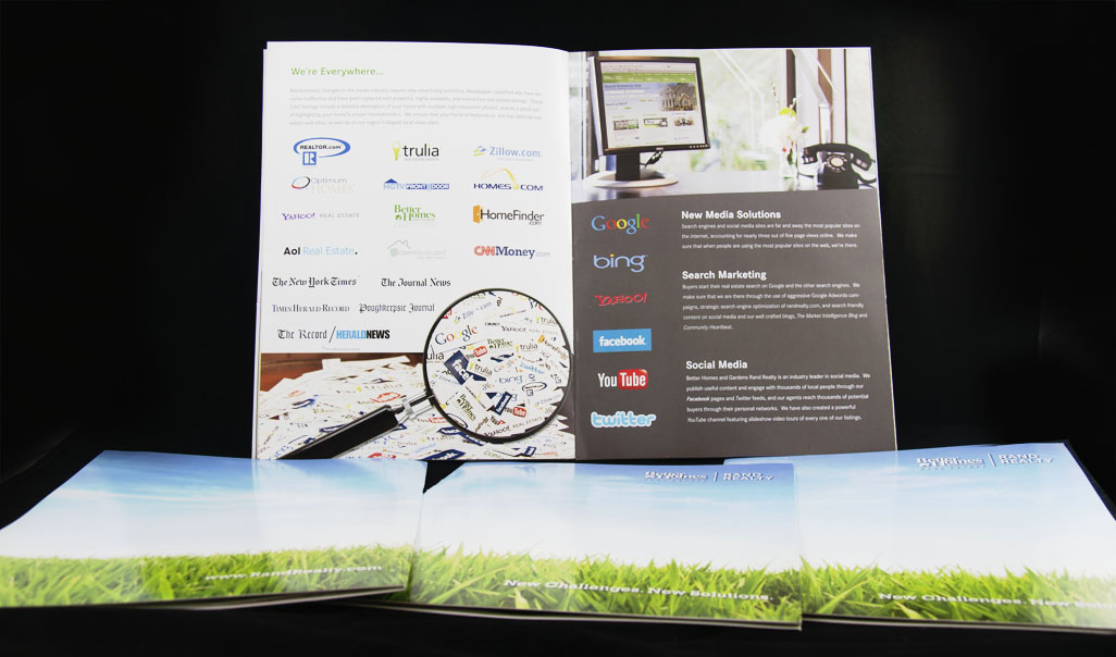
All serious marketers are aware that a brochure is a powerful tool to raise awareness of products and services. Many business owners shy away from them today due to perceived expense, preferring instead to use free alternatives like a well cultivated email list. There still is really no replacement for a well designed brochure and when you use a single folded sheet the cost per unit can be reduced exponentially. Single sheet brochures are boring, you say? Think Again! The following is a list of common brochure folds and some creative foundations to utilize graphic design to stretch your marketing budget to its fullest potential. Thus engaging your prospects and converting them to paying customers. All of this for just pennies on the dollar. Hey, that’s cheaper than pay-per-click!


The Half Fold

Diagram of a Half Fold Brochure

Half Fold Brochure

Brochures utilizing half folds have a lot of potential for conveying luxury. This is due to their plain yet functional style. In their purest form Half Folds are merely a greeting card. However, with the right message you can use them to showcase your individual products. Imagine a display rack at a trade show filled with these cards exhibiting all of your products in their own light. Your prospects can then take the one they need, but leave the rest. When they get home, they’ll have something to remember you by. All this and you have actually saved money by using less material.


The Tri-Fold

Diagram of a Tri-Fold Brochure

Tri-Fold Brochure

Ah, the old standard. When most people think brochure, this is what comes to mind. Tri-Fold brochures are useful because they can easily fold down to the size of a number ten envelope then be wafer sealed and self-mailed. The multiple panels are also useful for breaking down your company’s products or services into different categories. Each of the panels can conveniently become their own subject. A brochure doesn’t have to be on a letter sized sheet. If you want to make a bigger impression try using a 25.5 x 11 inch sheet folding down to 8.5 x 11. This can be an impressive presentation and is still cheaper than saddle stitching multiple sheets.


Z-Fold and Accordion Fold

Diagrams of a Z-Fold and Accordion Fold Brochures

Z-Fold and Accordion Fold Brochures

The Z-Fold is an alternative to your basic Tri-Fold. It has all of the advantages of the Tri-Fold, but it will sometimes make organizing your brochure’s content easier because the brochure opens straight out. With the Z-Fold you don’t need to worry so much about what content appears on the inside right panel and how that relates to the rest of the brochure when viewed flat. If you want to really stand out make a horizontal Z-Fold so that the content drops down as you open up its wafer seal. The physical world is a wonderful place and this sort of customer engagement is never truly able to be duplicated in a digital format. If you have a lot to say and three panels just aren’t enough, you can add one or more panels, and Voila! You have an Accordion Fold. Keep in mind though, that the more panels you add, the more difficult it will be for your reader to hold the brochure.


Gate Folds

Diagram of a Gate Fold Brochure

Gate Fold Brochure

Gate Folds literally open themselves to a plethora of design possibilities. Their functional style allows them to be opened like doors. The result is a very engaging user interface beckoning the beholder to discover the mysteries contained within. The added advantages of the gatefold are the two resulting partially folded panels appearing on the left and right side when opened. You can conveniently use these panels to list product and service features without cluttering the appearance of the center panel. The Gate Fold is another time when you should not be afraid to explore size alternatives. They particularly lend themselves to Horizontal Formats.


Double Gate Folds

Diagram of a Half Fold Gate Fold

Half Fold Gate Fold Brochure

Maybe you’re super loquacious and neither a Half Fold, nor a Gate Fold is enough space, but really you like the features of both. You’re in luck! The Double Gate Fold marries the unique properties of the Gate Fold and the Half Fold. Once again it is really fun for your audience to open them up. You can also use partial folds on the outside panels to more easily organize content. Another trick of the trade is to have the outside panels offer a tantalizing message opening up to two more surprises. If you have a larger budget you could include a compelling message about a free giveaway. The side panels in-turn open to scratch off areas. Meanwhile the two center panels display important content about your featured products or services.


Half Fold then Tri-Fold

Diagram of a Half Fold Tri-Fold Brochure

Half Fold Tri-Fold Brochure

Do you have a lot of important information to convey? Do you still need the brochure to fold down to the size of a simple tri-fold for mailing or display purposes? Relax, there is an easy fold solution for this. The Half Fold then Tri-Fold can be a real money saver for direct mail and is great for newsletters. With it you can take an 11×17 sheet of paper and fold it into four 8.5×11 panels. Now you have four large content areas to describe your products. With some well planned graphic design you can further fold the brochure into a nicely display Tri-Fold giving it the ability to be easily displayed or mailed. Simply leave room on the front panel for a compelling cover and mailing area.


Barrel Fold/Roll Fold

Diagram of a Roll Fold or Barrel Roll Brochure

Roll Fold or Barrel Roll Brochure

Roll ’em out. Roll Folds are another affordable super engaging fold. Each panel rolls out to show more content.You can use this format to entice your prospect to continue reading and find out what is at the end. This can be a challenging fold to design for because, each visible panel delivers a little bit more information than the proceeding version. As a result the message tends to roll out. Some creative design ideas for the roll fold include: spelling out words, piecing together images like a puzzle, utilizing perforations so you can actually tear the brochure apart as you read it.


Half Fold then Half Fold Brochure

Diagram of a Half-Fold Half-Fold Brochure

Half-Fold Half-Fold Brochure

Just like the name implies it is simply a sheet of paper folded in half and then in half again. The advantage of this fold, though, is that you can have two completely separate messages. One side of the sheet can be divided into four panels listing the benefits of your products. It even open’s as a regular half fold brochure, giving you that simple yet functional feel. However, when you open the second fold you are staring at a single panel. Think Posters! The Half Fold then Half Fold brochure can be extremely useful as collateral for youthful markets. If the graphic design is cool enough, you’ll have your company’s logo displayed right on your target audience’s bedroom wall! Talk about viral.


As you can see, brochures are still a vital part of any integrated marketing campaign. No matter what your objective or audience, there is a brochure fold that will reach it in a cost effective manner. You just need to be aware of the options that are available. If you have suggestions for other creative ways to implement the basic brochure folds in graphic design please feel free to mention them below.

Real Estate Postcard Design to Attract Prospective Home Sellers

Photo of a pile of postcards

Thinking of Selling? Real estate postcard designed to attract potential home sellers.

In 2012, I was charged with the task of creating a direct mail postcard to encourage potential home sellers to list their properties. It was a very strange time to work in real estate because things were just beginning to transition from a buyer’s to a seller’s market. This meant that there were a great many buyers in the Hudson Valley looking for great deals, but most homeowners were squeamish about listing their properties because of the perceived depreciation in market value.

A bold message was required to convince home sellers that it was in fact a good time to list their homes. The message was simple, “Thinking of Selling?” on the front with the headline on the back “Now’s The Time.” A brief message explaining the current market conditions with just enough information to entice prospective home sellers that they could potentially get a good price for their home. All it states is, “If you are thinking of selling this is the time. Lots of buyers out there waiting for the right home to come to market. Inventory is low. Curious about the value of your home in today’s market? Call me at 914-424-7160”

The postcard was created using Adobe Photoshop and InDesign. The standard Better Homes and Gardens grass and sky branding background was utilized, but in a unique fashion. In this case I silhouetted the grass, which proved to be very time consuming, so that it could overlay a pocket watch. The pocket watch is the compelling image in this design and it is used to tie the “Now’s the Time” concept between the front and back of the postcard.

The postcard utilized variable data in print production so that the designs could be personalized for the individual real estate agents. This way they are able to include their name, photo and contact information reaching the mail boxes of their sphere of influence. This postcard design proved to be fairly effective in bringing in listing leads.

If you have a direct mail project that you would like to have produced yesterday, you better stop the clock and contact Ortner Graphics immediately.

Real Estate Listing Presentation Brochure

digital image of listing presentation brochureOne of the core pieces of marketing collateral for any real estate brokerage is the listing presentation brochure. The listing presentation brochure is what real estate agents show to perspective home sellers when they are attempting to gain a signed listing contract. Most major real estate brokerages have a listing presentation of some sort. It helps to ensure that agents have a definite brand message to convey on what sets their services apart from the competition.

The importance of this piece of marketing collateral can not be overstated. The listing presentation in essence becomes a real estate brokerage’s brand standard guideline. Therefore a great deal of planning and consideration goes into one of these projects. I had the fortunate experience of working on Better Homes and Garden Rand Realty’s listing presentation brochure.

The brochure is sized at 9 inches by 12 inches and is saddle stitched into a pocket folder with business card slits. The pockets are useful for real estate agents so they can neatly include market analysis, letters of recommendation and other persuasive material in the presentation. Rand Realty uses a vertical business card so the pockets of the folder actually needed to be somewhat larger than a standard pocket folder. Therefore, a custom die needed to be created for this project.

Listing Presentation Brochure Cover

The listing presentation brochure cover utilized Rand Realty’s brand grass and sky supporting image with a logo. a simple sleek style designed to impress

Photo of first interior page of listing presentation brochure

The first interior page of the listing presentation introduces the prospect to the brokerage.

photo of interior pages of listing presentation brochure

The second and third page of the listing presentation brochure showcase some of the tools and programs that set the brokerage apart from the competition. The computer photo on the panel on the spread was taken by Eric Ortner

photo of interior pages of listing presentation brochure

The fourth and fifth page of the real estate listing presentation brochure examines where potential home buyers come from and the real estate brokerages market area. This spread needed to utilize a lot of infographics to elaborate on the content.

photo of listing presentation brochure

The center spread pages five and six showcase the brokerage’s website. Two pages of the brochure are dedicated to the website due to the real estate industry’s increased use of the internet to sell homes.

photo of interior pages of listing presentation brochure

The eighth and ninth pages of the brochure discuss listing syndication along with the use of social media in selling homes.

photo of listing presentation brochure interior page

The closing interior page of the listing presentation brochure covers the brokerage’s affiliated business along with their communication tools

photo of back cover of the listing presentation brochure

Back cover of the listing presentation brochure wraps the  grass and sky image around unifying the brochure.

Code Bloat Microsoft Word Verses OpenOffice.org

It is no secret that there is a great deal of code bloat created by Microsoft Word. In fact, it is always recommended that any text posted onto the internet be copied from a basic text editor for this reason. In a perfect world this can always be done. However, in the real world, sometimes you just have to cut a few corners in order to get things done in a timely fashion. I made a discovery this week, regarding word processor code bloat as it pertains to Microsoft Word and OpenOffice.org.

Let me start from the beginning, I have been using an old version of Microsoft Office Word 2004 for Mac for almost as long as it’s been released. Being a graphic designer, pretty much the only thing that I need Word for is to open Doc files and paste them into InDesign or other text editors like TextEdit or TextWrangler. Shelling out $130 or more for the luxury of text editing just seems to be unfathomable. After all, I live in Rockland County near New York City and that $130 really needs to get spent on rent, or perhaps something more fun than a word processor.

Recently I’ve been running into more and more issue opening up .docx files. Therefore, I decided to give OpenOffice.org a go several months back and try to save the $130. I’d used Open Office for Mac in the past, but it needed to be run out of a Linux window and was a clunky nightmare as a result. Let me just start out by saying the current version of OpenOffice.org 3.4.1 is awesome and a vast improvement!

I’ve recently been involved with a website based in the Blogger/BlogSpot CMS platform. The project required taking tons of old content originally printed on paper and transferring the digital files to Blogger. I initially started copying the files into InDesign to lose all of the excess code bloat and then pasting the resulting text into Blogger’s compose post dialog box. Simple enough, but a lot of the text needed to be reformatted once I brought the stripped out text into Blogger. It was going to be way too time consuming to reformat everything.

Therefore, I took the lazy way out and just started posting it straight into Blogger from OpenOffice.  Following this production method, I noticed right away that the Blogger Theme I was using was displaying some minor code bloat in the site’s post snippets. Well we can’t have that, so I reluctantly went into the HTML view and deleted the bloated code out of each article. It was still faster than re-typesetting everything, after all.

Last night, though, I pasted an old article out of Microsoft Word 2004, which I opened just out of old habit. I was surprised at how much more code bloat seemed to be getting carried over to blogger from Microsoft Word.

So I decided to conduct an experiment and share the results with you fine readers. Both of the examples below used the same exact Word Document. One example copies the document’s text directly from OpenOffice.org into Blogger. The Other copies the text Directly from Microsoft Word 2004 into Blogger.

Screen Grab of Microsoft Word Code Bloat

An illustrated example of the amount of code bloat that is retained when a Word 2004 document is copied and pasted into an HTML text editor

Screen grab of Code Bloat in Open Office

An illustrated example of the amount of code bloat that is retained when a OpenOffice.org document is copied and pasted into an HTML text editor.

I think the results here, really speak for themselves and once again, Microsoft sucks! I’m starting to sound like a broken record. There is simply way more code bloat being produced by Microsoft Word than a OpenOffice.org text document. I found this to be pretty interesting, and useful information (I know I’m a total nerd). I only wish I could further this comparison experiment with Word Perfect, iWork and Microsoft Office X. Based on my statements above, there’s obviously no way I’m going to purchase any of those programs. If any of you readers happen to take an interest in this and want to conduct your own research with these other programs, I would love to see the results, please post them below.

New Development Real Estate Websites

New Development Website Photo Montage of home construction sites.

Did you know that You can create a dedicated website for less than the cost of a quarter page ad in the Hudson Valley Region’s major publications? That means you can get an affordable dedicated website that will serve your new construction project for a full year for less than the cost of one day’s worth of traditional media. Meanwhile, you will be reaching thousands of potential buyers twenty-four hours a day. When you look at the numbers in that way, why should you depend on the media outlets at all to bring potential buyers onto your job site?

Eric Ortner has close to ten years of experience successfully marketing real estate new developments.  Put that expertise to work for you.  Find out more here or just contact ortnergraphics.com today and receive a free consultation to help you take your new home sales to the next level.